Yes, that’s right.
Not only is he completely adorable and hilarious, the man is now responsible for my choices in decor.
You’re probably scratching your head at this point, so let me explain.
Back when I finished our master bedroom makeover, I liked it, but something was just not right. Couldn’t really place what it was, but just wasn’t completely in love with it. Then it hit me.
It looks like a woman’s room. Not a married couple.
My husband, being the awesome guy that he is, didn’t mind in the slightest. He said over and over again that he thought it looked great, no need to go changing anything.
But I just couldn’t shake how girly it was. It’s OUR room, it should look a little more like us, not just me.
Since I just did all that work, I didn’t want to go repainting the walls or anything, but I thought if I could just swap the bright orange and aqua for some other color, and bring in some more wood tones to ground the space, we’d be good to go.
Then I’m watching my Jimmy. Er, I mean, Jimmy. Just Jimmy.
And it was like a lightbulb went off!
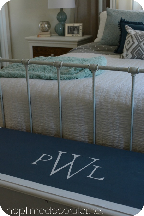
There he was, doing his monologue…in a dark blue suit, white shirt, and light blue/green tie. The same EXACT color as my lamps and throw pillows I picked up a few months ago…I decided right then and there that dark blue would be replacing the orange. Yes!
I mean. That man. What’s not to love?
Ok, back to the bedroom decor…
So let me share with you one of the ways I recently brought this color into the room.
Remember this chest I did?
(I tried to find the link and that post, along with my master bedroom makeover, were both lost when my old site was hacked. Boooo!)
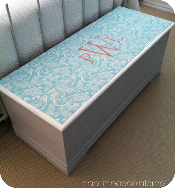
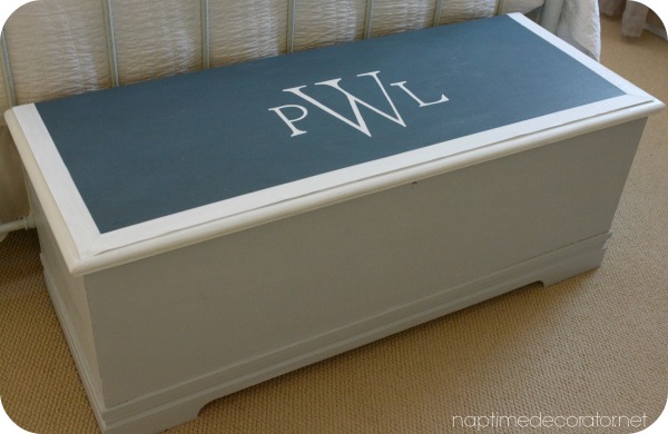
It was a beat up trunk I found at a flea market, I painted it light gray on the base, and used Mod Podge to attach fabric to the top, then painted our monogram in orange on it.
I thought if I pulled up the fabric, painted it dark blue, then did the monogram thing in white…that would look cool, right?
Well, I tried to pull it up and MAN. That Mod Podge is good. It wouldn’t budge. So I decided to just try painting over it? What’s the worse that could happen?!
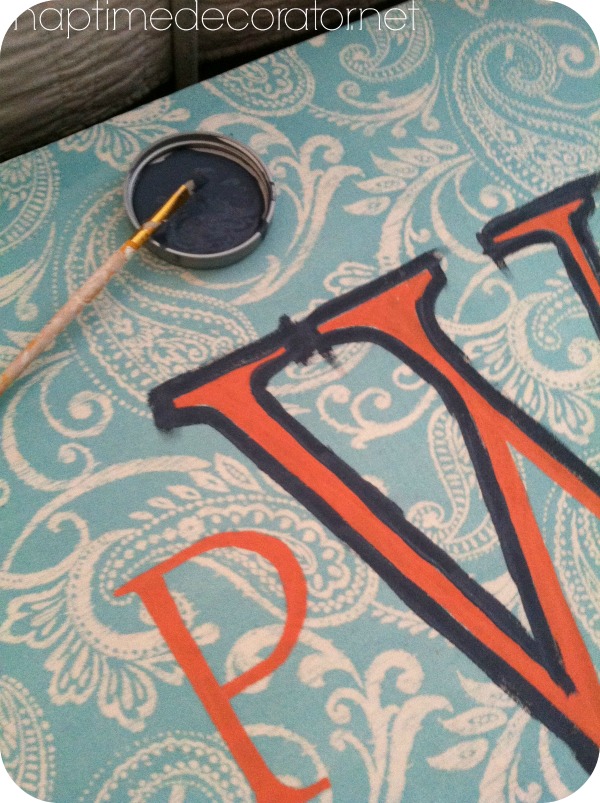
I painted around the letters first…
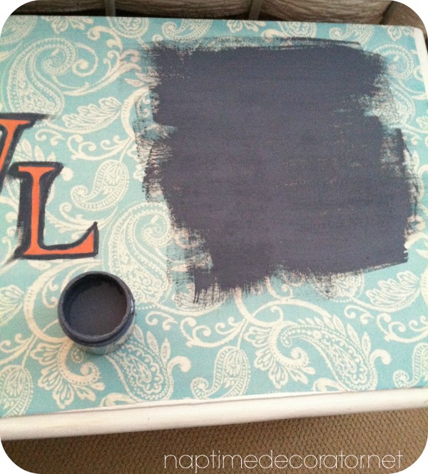
Then filled in the rest…
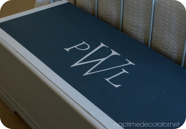
It’s called Denim by Olympic, by the way. DREAMY color. Almost navy, but not quite. Like a midnight blue. I love it.
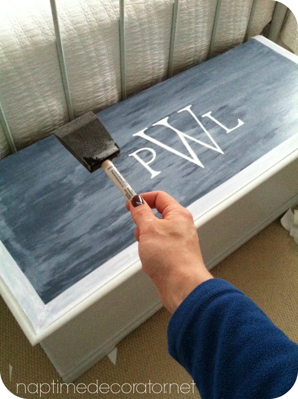
Then I filled in the orange letters with white craft paint.
The edges looked like they needed something, so I picked up some wide white grosgrain ribbon and cut the edges diagonally (like a mitered edge), and used Mod Podge to stick it on there. Then I decided the give the whole thing a coat of Mod Podge just to protect the paint. It felt really rough and wasn’t sure how it would hold up without something on top of it.
And here we are!
A little more manly, dontcha think? 😉
I’m feeling good about the changes in here. I’ve got more updates to come, stay tuned!
Thanks, Jimmy;)

 Hi there! I’m Liz, a former teacher-turned-stay-at-home mom to three kids, with a passion to create a warm and inviting home on a budget. This blog all started when I’d put the babies down for a nap, and squeeze in a project during those precious couple of hours! My hope is that you visit this page and feel inspired to do a little “naptime decorating” of your own. Thank you so much for stopping by!
It looks great! I liked the orange but the darker blue looks much richer. The aqua, blue, white and gray really complement each other.
Thanks, Suzanne!
Ooooh!! I love it!!!
Thank you, Karen!
Beautiful! I’m a huge aqua fan and our bedroom is mostly aqua, white and lime green but I like how you added the dark blue which would look great w/ the lime green too! Thanks for the idea – and yes, I love Jimmy too!
Thanks, Lynn!
So like you I wanted to trade in the feminine look and make our bedroom look like belongs to a couple. I just bought a new King aqua comforter w/ shams (awesome deal on Groupon for $39!) which I love with my light green larger pillows but I was thinking of this post and just had to reference back to it!! Hubby is out of town on biz so I ran to Target today and bought a soft navy blue blanket that I placed at the bottom of the bed and tomorrow I’m in search of a new accent pillow to pull it all together. I think he’ll like it!
So fun!! Hope it all turns out perfectly for you and your husband!