Once upon a time, our front door was a beautiful, bright red. It looked great against our half brick, half blue-grey siding house. Navy shutters, some white trim. It worked.
Fast forward some years, and that red…well, she ain’t so red anymore. You can see in this shot just how faded and pink it’s become – the circle is where our magnetic hook sat all these years to hang our wreaths on…
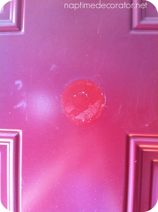
Geesh.
Funny how some things, you just don’t notice JUST HOW BAD they are until you really look at them, right?!
I knew our door needed a new paint job, but wasn’t aware of just how badly.
But what color?
Red works, sure. I knew that.
But you know me, I have to mix things up after a while.
I’ve been contemplating a burnt orange…so seasonal after all;)
Or I could go a safer route – like a coffee color or grey…to bring out the brick.
Hmmm…
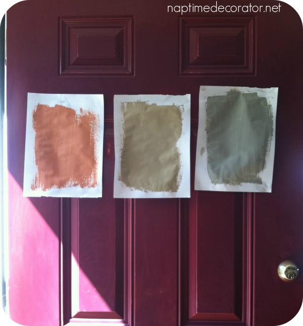
So I picked up a few samples at Sherwin Williams.
1. Chrysathemum
2. Latte
3. Pavestone
I painted them on some paper and taped to the door…
I sanded my door, wiped it clean, taped up the doorknobs, primed it, and looked at it again…
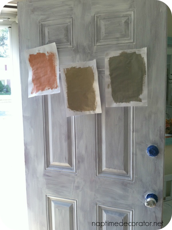
And I’m still confused…
If your house had this combo:
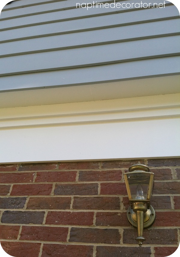
(picture the light fixture painted oil-rubbed bronze and minus all the cobwebs;)
…what would you pick??
Inquiring minds want to know…and want your help!!
Thanks, fabulous people!

 Hi there! I’m Liz, a former teacher-turned-stay-at-home mom to three kids, with a passion to create a warm and inviting home on a budget. This blog all started when I’d put the babies down for a nap, and squeeze in a project during those precious couple of hours! My hope is that you visit this page and feel inspired to do a little “naptime decorating” of your own. Thank you so much for stopping by!
I like the orange!
I would do the middle one – a neutral color. You will tire of the green and orange AND neutral is great to put up any seasonal décor!! Just make sure the middle one matches inside of your house with the door open if you have a screen door.
I’d try the darkest color.
I like the orange, my only concern would be that it is distinct enough to not blend in with the orange on the brick too much
YESSS!!! That was my EXACT thought Brian – if it was up against the blue, I’d do orange in a heartbeat, but the fact that it’s on the brick half of the house, makes me want to go a different route.
The color on the far right. The greenish one. It would go with every season.
Try a deep midnight charcoal it has a hint of blue to tie in your shutters and all your seasonal wreaths will pop and look amazing ! I did an orange once it was very limiting for decorating.
Have you considered yellow? I think a nice yellow would look cheerful and fresh!
YES! I love yellow, and in the springtime, I was all gung-ho to paint it that…but now that it’s Fall, I’m not as pumped to do yellow anymore;)…it’s only paint though, so maybe come April I’ll bust out the yellow paint! hehehe….
Are you changing the shutters too? That would affect my choice.
Also, since you usually have something seasonal up on your door, I’d compare the color with the wreaths you already have.
I think I like pavestone best, but it’s hard to know for sure. Good luck!
I really like the far right color. But that’s me. Personally, orange would limit what I could put up, but the far right one seems bold, but versatile enough for all seasons.
Orange definitely xxx
I like the middle one
I like Barb’s suggestion of the dark charcoal gray – ties in nicely with the blue trim and the brick. And pretty much any wreath or door decor would look lovely on it. If not that, I’d go with the middle color.
None of them. Go bold or go home! Honestly, I’m not feeling any of them. The orange is seasonal – but that season will pass and then you’ll have to decorate with orange the rest of the year. Plus, the orange will blend in with the brick. How about teal, yellow, or green?
Check out HGTV’s last few issues. They always have some awesome front doors that with a punch of color. I love a front door that just stands out and is cheery and welcoming.
What aBout a mustard or a plum color?
Pavestone!!!
I would go with a black door. They really pop! Do a Pinterest/Google search of black front doors. Aaahhhh-mazing!
I would go with a deep gold rather than the orange…
Agree the orange might be to hard to decorate for other seasons. Like the idea of the bluish charcoal or would go with 3 (or 2) depending which one stood out more from your siding – hard to tell on my computer.
I like the pavestone color. Neutral, but not blah. And will look great year round…..plus won’t fade too much from the sun
I’d go with the gray, whatever you chose will be fantastic!
I pick the middle color! The orange is pretty with the other colors, but seems a bit harsh & too contemporary for the rest of the house. The grey is pretty, but seems a little too close to the siding. Whatever you choose will look great I’m
Sure:) It always does!!
I’m not sure about the orange on the brick part either. My only suggestion is to consider what decorations go on there throughout the year, because you won’t want to have to redo everything to match the door (or will you….)
I love the idea of yellow, but not sure how well it works in winter. I think it would be nice in the other seasons, though, especially when things thaw in spring but before it becomes green.
I think yellow would look great with those colors, especially the navy shutters and it is fallish too! But of those three colors..I like the orange! Can’t wait to see what you do!